Devon Healing Horsemanship is a mental health charity specialising in horse-powered alternatives to talk-based therapy. I was a part of a challenging project to redesign their website in time for their first anniversary.
Some information has been obfuscated or omitted from this case study in order to protect the privacy of others. All information presented in this case study is my own and does not necessarily reflect the views of Devon Healing Horsemanship.
Details
Volunteer work
Re-design of existing website
Research
UX & UI design
Graphic Design
Photo Editing
Copywriting
Figma
Adobe Photoshop
Adobe Illustrator
Impact
The Devon Healing Horsemanship website continues to be worked on by a team of skilled volunteers.
The component library and style guide have since been used to create a series of informational banners and leaflets for DHH’s stall at the Festival of the Iberian Horse.
Background
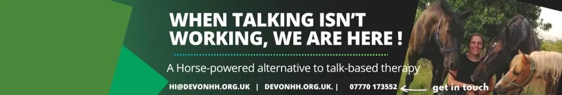
Founded in 2023, Devon Healing Horsemanship is the only approved charity providing interventions from The Horse Course in Devon. They primarily deliver The Horse Course ReStart: an action-based intervention utilising horsemanship to teach, rehearse and repeat key resilience skills. These skills are taught to those facing a mental health difficulty as an alternative when talk-based therapy practices have proven ineffective.
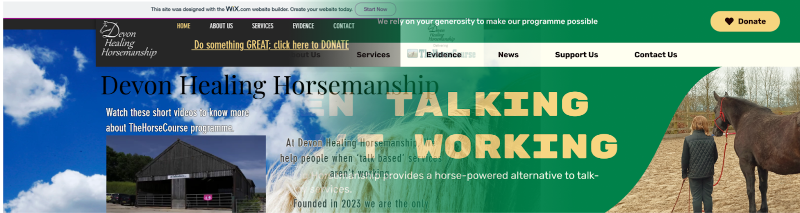
DHH’s existing website – designed in 2023, was attempting to stand out among other providers of The Horse Course with its unique appearance. However, it did not reflect the founder’s distinct outlook, it wasn’t optimised for mobile, and it wasn’t driving donations.
It was time for a change.
Challenge
Rebrand, Redesign, Relaunch
Our goal was to create a page that would properly showcase DHH’s work to funders and donors. However, we were aiming to be more than a donation page – we were also striving to create a welcoming place for potential participants and referrers.
Questions to Answer
-
Who are Devon Healing Horsemanship?
-
What makes DHH's work so effective?
-
Why should I donate to this organisation?
High Level Goals
-
Increase interactions from site visitors such as donations and contact referrals
-
Improve the sites search engine optimisation
-
Create a distinct and memorable brand image
Role
I lead the design of the website between April and June of 2024. This role involved research, UX & UI design, copywriting and some graphic design and photo editing.
I worked alongside the CEO of Devon Healing Horsemanship, and when the site was ready to be built, I handed it off to a developer.
I would return to the project a few times to perform QA tasks and interview potential developers.
The site launched in June 2024, in a partially complete state due to extenuating developer circumstances.
Research
I began researching indirect, aspirational competitors in the animal welfare and mental health spheres, to help determine the visual direction we should take the site in.
Early Insights
8 websites were examined with the goal of understanding what makes them trustworthy to those that need their services and attractive to those looking to donate.
Speaking to the Heart
Most competitor sites speak to the user directly with calls to action. They concisely explain their mission with copy that appeals to the user’s emotions.
Donation Opportunities
Across other sites, users were constantly being given reasons to donate and invitations to give.
Smooth Interactions
Looking at navigation across these sites emphasised practices that we were missing from the DHH site. Clear navigation in the header and footer were obvious requirements. Buttons and links across each individual page that lead to other areas of the site made working one’s way to the donation page feel natural.
Discovery
What surprised me about scouring competitor sites was the difference between larger, more indirect competitors and smaller charities like DHH. The information being presented was much the same between the two. The difference was that larger organisations had the resources to go all in on creating a strong visual brand and user experience that would make their site feel memorable.
Despite presently lacking the resources of a larger charity, we could still create a cohesive style guide and a good experience for the site’s users, giving them the look and feel they would associate with good work.
Insights
Before jumping head first into a redesign, it was important to determine what needed to change about the site, and define success based on these requirements.
Prior to redesigning, I created a list of user archetypes based on donor information provided to me by the CEO, and keeping what we had learned from competitor research in mind.
User Archetypes
-
Goals
- To be easily able to donate
- To see the value/impact of their donations
Barriers
- Lack of clear donation area on the site
- No reasons to donate beyond 'do something great'.
-
Goals
- They want to know how this is going to help their person before getting in touch.
- They need a breakdown of what DHH does and they need to see evidence that it works
Barriers
- Evidence page is not laid out clearly and doesn't highlight the outcomes to the referrer.
- Unclear how much evidence there actually is backing up these claims
-
Goals
- Service section lacks clarity and is difficult to read. It also does not link to the contact form or any kind of booking system
- Service section does not highlight benefits or financial costs of the programme.
Barriers
- Evidence page is not laid out clearly and doesn't highlight the outcomes to the referrer
- Unclear how much evidence there actually is backing up these claims
-
Goals
- Wants to find out where they are going, what they will be doing, who is going to be guiding them, etc. Essentially: what is this all about.
Barriers
- The 'About Us' page lacks warmth and acts more as an introduction to the concept of the charity, rather than its people.
- Site's copy doesn't effectively make a connection with potential visitors
These insights were primarily gained by examining donations from the JustGiving page, reading evidence and testimonials from other facilitators of TheHorseCourse, and speaking with CEO Louise about her target audience.
Landing Page Elevator Pitch
The original site did not sell itself as well as its competitors. At a glance, it was difficult to tell who this service was for and what its benefits were.
DHH sported experienced instructors, happy participants, and well-trained horses, but the original homepage put more emphasis on how new the charity was as an organisation. Equine-assisted therapy is a concept that not many people have even heard of, so it was important to emphasise what it could do and why you could trust DHH to facilitate it.
The new page design acts as a much better introduction to the charity, forgoing their age entirely to better emphasise who they are and what they do. Including testimonials to better show off their reputation among former participants.
All About DHH
As a locally focussed charity, it was important that people could get to know the team that they would be entrusting with their time, money and community. The original page featured a mission statement and a bit about the team and their values as a whole. However, it didn’t introduce the team – or the horses – as individuals.
Now, the page features individual cards for each member, including a photo to aid their recognition, and a short, first person introduction to keep things friendly. Even the animals get an intro, so the participants know exactly who they’re working with.
Effective Evidence
The Horse Course ReStart and its outcomes have been studied in many academic papers. These can be found on DHH’s “Evidence” page, but the average reader doesn’t have time to sift through them all to figure out what they can get out of the course.
A summary of the benefits shown in the papers emphasises our good points and lets the user know what they can expect to read in each paper.
Donation Strategy Design
Reason-Based Donation
Donors want to be part of something meaningful. The site’s original sole donation link – “Do something GREAT; click here to DONATE” shows understanding of this. Despite being highly prominent sitting in the middle of the navbar, it wasn’t pulling in donations the way that was expected.
A minor tweak brought this feature more inline with where people expect it to be. It became a button in the upper-right corner. The copy was also adjusted to reflect how much a donation means to the organisation – *you* make it possible. Additionally, it now brought the user to an in-built donation widget, rather than off-site.
Impact-Based Donation
Donors appreciate knowing the impact of their generosity. To encourage this, we created a widget that allows for monthly and one-off donations. The widget offers suggested payment amounts, with short descriptions of what that donation can cover.
Unexpected Constraints
Budget constraints were tight, and we could not afford to implement a widget that accurately represented the designs. While I still think the core elements of impact-based donation are there, I had hoped to include it in the Monthly section as well as the One-Off section. In the future, we may be able to cover the cost of a more accurate widget.
Something Meaningful
Donation opportunities are now spread throughout the site. When shown the price of a service for example, the viewer is invited to donate towards covering its costs for someone who needs it.
Alongside venue info, potential donors are also invited to improve venue accessibility by helping DHH to meet some of their long term goals.
Additionally, all visitors of the site are invited to sign up to the DHH newsletter so that they can receive updates on their meaningful work and receive further calls to donate right in their inbox.
Incentive-Based Giving
Devon Healing Horsemanship was actually partnered with several different incentive-based giving services before their site redesign. However, they were scattered across a number of external sites, with no central hub to find them all.
Adding the Support Us page makes it easier for visitors to find a way to support DHH that best suits them. It also means we don’t have to limit support to donations – the volunteering section allows people to offer up their skills instead.
Navigation
The original site already had a nav menu in the header, which was a good start. However, this was not compatible with mobile browsing, and required the user to scroll back to the top when looking through the site.
This was replaced with a sticky, mobile compatible variant, to begin tackling the site navigation.
Navigation from Mane to Tail
Navigation was also added to the footer, which was expanded again to contact links. This accounted for situations where the mobile menu may not be recognised by the user.
To encourage visitors to explore more of the site, we wanted to ensure that it was easy to get around most of it without relying on the menus. This meant ensuring that we made good use of links and CTAs throughout our pages.
Hand Off
With the majority of the design work finished, I would spend most of May and June working on polishing up the Figma library I had been working on in tandem with the site being built out. This would include proper documentation, so that the DHH team could understand it and potentially pass it on to another designer in future after my leaving.
I would also develop a short style guide based off of this library for the team to move forward with.
Screens
Testimonials
-
Amazing user experience website designer. Seriously can’t praise Dorian enough if you are like me and you don’t have time to hold someone’s hand through the process and you need someone who can take control of the project and make it happen. Dorian is the person for you. Their knowledge of users and the attention to detail on the user experience is amazing. I really can’t praise them high enough. Feel very proud to have them on the team building our new website.
Louise Broadway, Founder & CEO of Devon Healing Horsemanship
-
Dorian’s design expertise and attention to detail are absolutely fantastic. They’ve got an amazing grasp of what a great user experience looks like and it makes the building of a project that much easier when you’ve got someone with their expertise on board. Highly recommend you reach out to Dorian if you need someone to design on a project for you; I know I will!
Craig Fahrenholz, IT Manager at NAFEMS & Initial developer for the DHH website