Context
Details
Scope
Volunteer work
Improving design for prototype web-app
Role
Research
UX & UI design
Tools
Figma
Figjam
Adobe Acrobat
Impact
Info Gathering: User Survey
User Comments
-
"I feel like it's better to put all this info at the start rather than after I've done it."
-
"That's a really small amount of text for an (information) popup"
-
"Why doesn't it give me the full information before I make the saving?"
-
"This feels like it's for people who already know what they need to do to be eco friendly, but I'm a complete beginner"
Problems to Solve
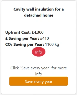
Upfront Cost & Savings
Red Info Button
Save Every Year
Overview
More to Show
What can we learn from our "Confirm Your Savings" screen?
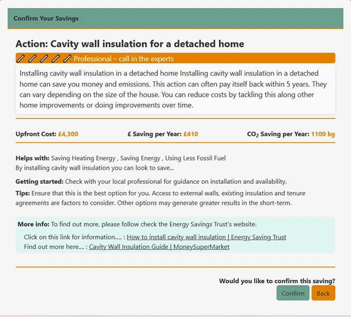
Professional - call in the experts
Installing cavity wall insulation...
Images
One comment stated:
-
"I want a picture of the dark cookware I'm meant to be buying"
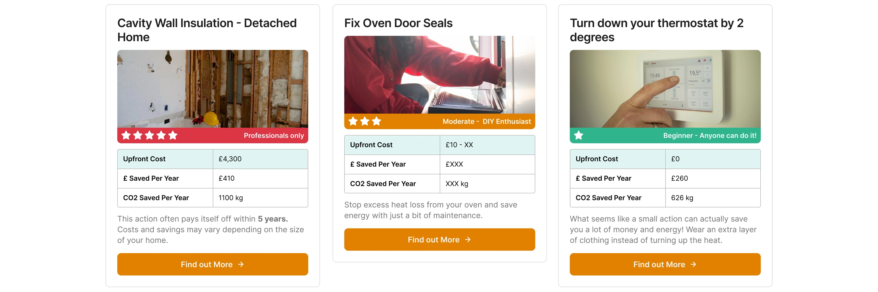
Potential New Card Design
Example Cards from Existing Actions
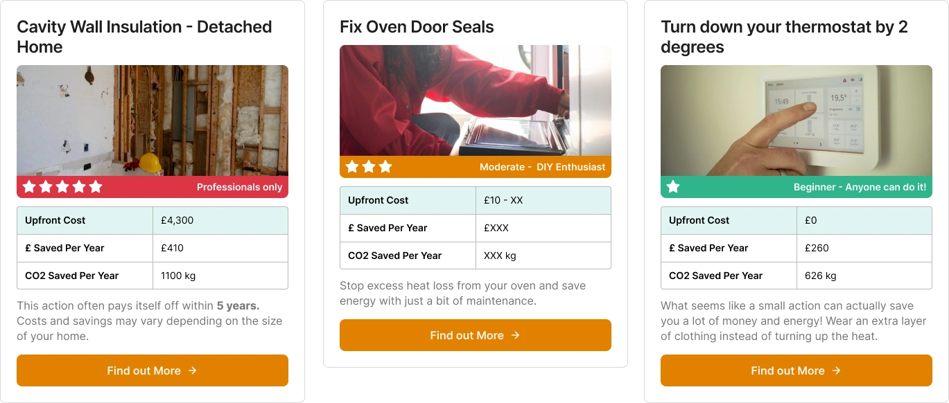
Changes
- Upfront cost has been highlighted in pale green to better stand out to the user
- Rather than hiding the info/blurb behind a button, we condense it and display it to the user directly
- Star rating pulled from the "Confirm Your Savings" page
- Primary CTA text changed from "Save Every Year" to "Find Out More" to lower the perceived level of commitment and to give some flexibility for actions that occur more often than annually
- Images added to illustrate what these actions could look like. Royalty-free images were used in this case, but we could take our own photos for simple tasks and contact local companies for photographs of more complicated tasks
Rating Frames
A Closer Look At The Component
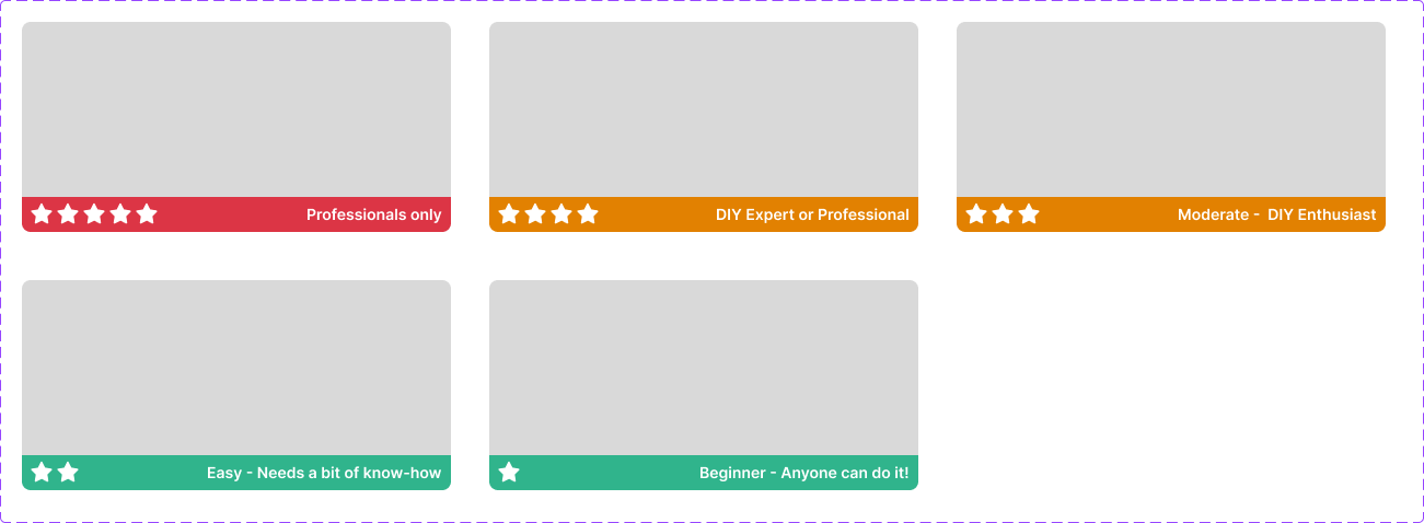
- Rating copy based on existing rating copy, just slightly shortened to allow for easier display.
- Changed ranking icon from wrenches to stars. Some users were mistaking the wrench emojis for bones at a small size.
- Colour-coding added to indicate difficulty at a glance.
- Five-star rating changed to professionals only. The vast majority of users will need to call in help and spend a fair amount of money to accomplish these tasks. This is not to gatekeep these tasks, but to prevent potentially unsafe DIY decisions.
Taking It Further
Applying our findings to the "Confirm Your Savings" screen
Relevant User Comments
-
"Oh I didn't know these were links (about Learn More / Read More / View Tips)"
-
"(User lingered over the 'Back' button before clicking confirm)"
-
"It needs like a 'did you know?' style section or something like 'here's some resources to get you started'"
Suggested Changes
- We received several comments asking for a "did you know?" style call to action. We also had requests for "resources to get started". This may indicate that we need to improve the visibility of this section.
- We also had some comments about the clarity of links. Many users did not click on anything in the 'More Info' section, and those that did were surprised by new pages opening up. This may indicate that we need to improve our clarity here.
- Some users lingered over the 'Confirm' and 'Back' buttons for a while. Expectations and best practices indicate that primary actions (confirm) should be right-most and more brightly coloured than secondary actions (back).
New "Confirm Your Savings"
A desktop redesign based on the comments and feedback provided.
View plain and annotated redesigns below