Tackling pain points within the “Income and Outgoings” portion of the digital customer journey. Created for Morses Club - a loan company that provided non-standard credit options.
Context
Morses Club PLC was a UK consumer finance company that offered a variety of loan products including home collected credit and online lending.
At the time of this project, Morses were making a push to move the majority of their services to digital and improve the usability of their existing digital lending services.
Details
Scope
Full-time
Improvement on existing product
Role
Concept
Research
UX & UI design
Tools
Figma
Figjam
HotJar
Impact
The implementation of the new Income and Outgoings structure resulted in an 18% increase in acquisition journey leads during it's first week in use.
Embracing the interspersed solution ensured that users had ample time to review and consider their answers, contributing to improved accuracy.
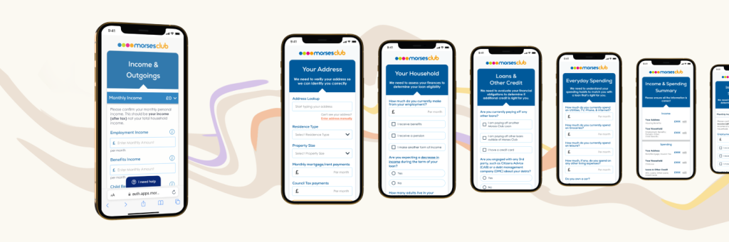
Further research and feedback revealed the necessity for a "summary" page, aggregating all Income and Outgoings inputs from the form, offering customers a final opportunity to rectify errors before proceeding.
Problem
Having no existing customer data to rely on meant that the initial design for the digital customer journey had a degree of freedom and exploration in its design. However, it also meant that the initial Income and Expenditure page design was primarily driven by business interests and compliance guidelines, rather than being more tailored to fit Morses’ actual user base.
The Income and Expenditure section of our online form faced poor customer reception. Customers could not figure out the purpose of the disposable income calculation, or why certain inputs were required from them. This was not aided by the length of the page, which was much longer than other pages in the form.
Key Question
How can we reduce form-fatigue while still essentially keeping the same number of questions that we had before?
Proposed Solution
Rather than sticking with a single page, we opted to take the Income and Outgoings inputs and spread them across our existing form pages. Relevant Income and/or Outgoings questions would be grouped with other existing questions in a similar vein. For example: mortgage and rent payment questions would be placed next to address and household questions.
![]()
Research
To gain a clearer understanding of where we stood among our competitors in terms of I\&E questions, other online lenders were examined. The majority of them had significantly shorter I\&E sections, with some of the longer variants splitting the questions across the rest of the form, and others providing a summary detailing the monetary amounts entered by the user.
HotJar analysis helped to determine which areas of the form were most likely to be filled incorrectly. It also revealed that users failed to make use of the tooltips most of the time. What was notable however, was that when a customer did manage to use the tooltips, they would go on to use them for most inputs on the form.
This made two things apparent:
- Customers did not know the majority of their I\&E input data off the top of their head, and were either filling them in incorrectly, or not at all
- Customers needed to be shown more information to feel like they could comfortably answer our questions.
Research Presentation
Ideation
Following data examination, a strategic choice was made to develop two distinct and innovative UX solutions, each presenting a radical departure from each other.
Pure Progressive Disclosure
Initially, only the employment input would be shown to the user.
Additional fields remain hidden until interaction with a checkbox or button triggers their display.
This strategy aimed to create a more concise and approachable initial page and percent aimless scrolling through similar fields for a more focussed experience.
Interspersed
Income and expenditure inquiries would be grouped with related questions. For example: housing benefits and rent payment questions would be situated alongside address-related questions. This arrangement aimed to deter question skipping, and ensure that customers were in the appropriate mindset to provide accurate responses.
Micro-Solutions
Development
Opting for the “Interspersed” solution diversified the page layout, reducing the risk of visual overload that the original Income and Expenditure (I\&E) page carried. By breaking up the page across several existing pages, we reduced the monotony that was previously there when the user had to scroll through every I\&E question at once.
Replacing manual tooltip icon buttons with an automated process that makes additional information appear when the user clicks on the actual input reduces visual clutter. This enabled us to ask more elaborate questions where needed.
Implementing progressive disclosure allowed us to conceal non-applicable or optional questions, streamlining the user interaction for increased efficiency.
Demos
Input Demos
Final Prototypes
Testimonials
-
Dorian has a remarkable ability to capture not only what you want but what you need through design. ... They can consistently back every design with customer data, competitor analysis or best practice so you know that every detail has been thoughtfully created in a way that keeps user experience at its heart.
Sidonie Lawrie, Head of Product at Nurtur.Tech, Former Digital CX Product Lead at Morses Club
-
During our time together at Morses Club, Dorian consistently demonstrated a deep understanding of industry standards and trends in UI/UX design space. ... Dorian's talent, professionalism, and commitment to delivering top-notch work make them a valuable asset to any team.
Troy M, Business Analyst at CMAC Group, Former Business Analyst at Morses Club