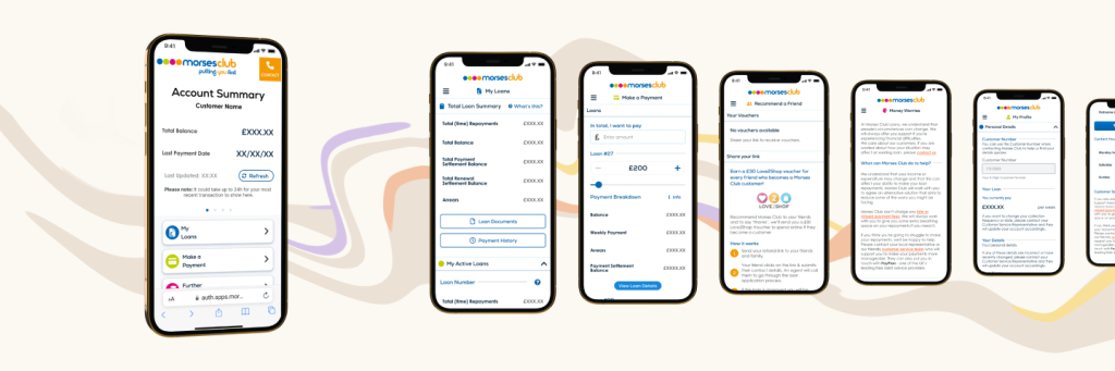
Account dashboard for finance applications, payments, loan details and personal data management.
Created for Morses Club - a loan company that provided non-standard credit options.
Context
Morses Club PLC was a UK consumer finance company that offered a variety of loan products including home collected credit and online lending.
At the time of this project, Morses were making a push to move the majority of their services to digital and improve the usability of their existing digital lending services.
Details
Scope
Full-time
Improvement on existing product
Role
Concept
Research
UX & UI design
Tools
Figma
HotJar
Impact
Streamlining the design of the customer portal gave the site better clarity of purpose.
Morses experienced a significant reduction in calls and complaints regarding the customer portal.
Problem
The customer portal served as a vital hub for users to manage personal data, apply for finance, make payments, and access loan information.
However, the platform design was outdated, and modifying it previously depended heavily on third party development.
The portal suffered from an outdated design that underutilised available screen space; lacking modern features and clear functionality. It also lacked crucial visual cues such as icons, badges and distinct button shapes, compromising its usability and clarity of purpose for users.
Key Question
How do we shift towards a more function-forward portal without stripping it of the brand's personality?
Proposed Solution
Removing the non-functional “hero” banner and reducing the bright colours to declutter the visual layout while assigning meaning and recognition to the retained colours.
On-screen actions would be re-ordered based on user and business priorities.
Icons and badges would be introduced with the aim of guiding customers towards frequently used and essential features.
The layout would also be newly optimised for mobile.
Research
Competitor Research
Upon comparison with our direct and indirect competitors, it became apparent that our portal fell short of customer expectations.As Is: Product Analysis
While our portal had an inefficient “Hello” banner, competitors utilised their headers to deliver relevant product news and display customer balances, providing more valuable information. Coloured buttons, while aligning with the brand, lacked clarity due to the absence of icons, vague action titles, and shared colours across unrelated features. This would pose challenges for users with impaired colour vision and situations requiring black-and-white displays, impeding action identification and page distinction.Ideation
Wireframes
After creating the initial Figma design sketches, I collaborated with the Portal team, leveraging their experience with direct customer interaction. This collaboration spanned several weeks and involved multiple feedback sessions. Valuable insights emerged from this iterative process, indicating that customers would benefit from condensed announcements in a smaller header.Minimum Viable Changes
Additionally, it was identified that prominently displaying customer number, balance, and customer service agent contact details on the initial home screen would provide easy access to vital information typically required when reaching out to us for assistance.Visual Development
Branding
Third-party icons were utilised to expedite the process, and where required, custom vector icons were created for specific user needs, enhancing user comprehension and navigation through visual cues.
These icons, integrated into coloured spheres following the logo design, reinstated brand identity without compromising clarity.
Vital details such as announcements and customer information were deliberately presented in black-and-white high-contrast, ensuring enhanced readability and ease of location for users.
Component Library
Established a Figma Component Library post-wireframe development, housing reusable elements for consistency and scalability across current and future designs.
This approach streamlined implementation for programmers and QA testers by ensuring cohesion across current and future designs. The creation of this library promoted design consistency, easing implementation and facilitating efficient testing and development without extensive oversight.
![]()
Screens
Testimonials
-
Dorian has a remarkable ability to capture not only what you want but what you need through design. ... They can consistently back every design with customer data, competitor analysis or best practice so you know that every detail has been thoughtfully created in a way that keeps user experience at its heart.
Sidonie Lawrie, Head of Product at Nurtur.Tech, Former Digital CX Product Lead at Morses Club
-
During our time together at Morses Club, Dorian consistently demonstrated a deep understanding of industry standards and trends in UI/UX design space. ... Dorian's talent, professionalism, and commitment to delivering top-notch work make them a valuable asset to any team.
Troy M, Business Analyst at CMAC Group, Former Business Analyst at Morses Club